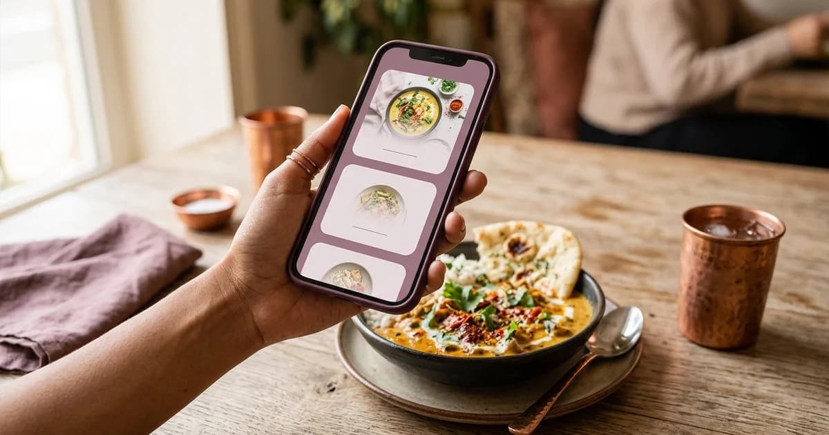
What makes a restaurant menu usable on a phone?
A mobile-friendly menu lets a guest find and read the relevant choices on a small screen without repeatedly zooming, losing their place or guessing how to continue. It can be a web page or a document, but the design should keep item names, descriptions, prices and next actions understandable at the size guests actually use. The restaurant should test the full guest journey, not just view the page on a desktop preview.
Organize content for a small screen
Give the menu a clear sequence: recognizable sections, descriptive item names, concise explanations and prices close to their items. Use headings that help guests scan the page. Avoid forcing people to interpret color alone, and do not put essential meaning only inside an image. When using photographs, keep them purposeful and avoid making the page too heavy for guests on a limited connection.
If the menu is long, make it possible to move among sections and return to the menu after opening a detail or link. Keep navigation labels specific. A guest should not need to scroll past a long promotional block to reach the items they came to see. Ensure prices and availability remain associated with the correct dish as the layout changes.
Check text, controls and reflow
W3C’s WCAG reflow guidance describes presenting content at a narrow viewport without loss of information or functionality and without requiring two-dimensional scrolling for ordinary content. Applied to a menu, this means checking that content can flow in a single column, text can be resized, and controls remain reachable. Do not assume that a page meets accessibility requirements just because it is responsive.
Links and buttons should have understandable labels and visible action cues. Item options need clear labels; essential information should not be conveyed by a colored dot alone. Ensure readable contrast between text and background. Test with enlarged text and a narrow browser window, then confirm that a guest can still access the same menu content and ordering controls.
Test on real phones and connections
Open the public page on both iPhone and Android phones available to the restaurant. Test the QR code from its print placement, try the restaurant network and a mobile connection, and note whether the menu loads without an account. Check whether images appear, prices remain legible, section links work, and any ordering or contact control leads to the intended next step. Ask someone unfamiliar with the menu to find a named dish and its price; observe where they hesitate rather than telling them where to look.
Keep accessibility and alternatives in the workflow
Some guests may not have a compatible phone, sufficient battery, a data connection, or a preference to scan. Staff should be able to provide a printed menu or another reasonable method to read the same information. W3C guidance is a design reference, not proof that a particular restaurant page conforms; review the actual content and interaction against the applicable criteria.
For related details, see QR menu versus PDF menu, how to create a restaurant QR menu, and how to show sold-out items on a digital menu.
Sources and further reading
- W3C WAI: Understanding WCAG 2.1 Reflow
- W3C WAI: Understanding WCAG 2.2 Use of Color
- W3C WAI: Designing for Web Accessibility
Source links support the facts above. Check dated source material for current details.
Keep reading